
Here, you'll find a collection of my work from a 16-week UI & Prototyping course. These projects highlight a variety of user interface designs as well as prototypes using Figma. Throughout the showcase, I will explain a few of the techniques and concepts I applied throughout the process.
Duration: 16 Weeks
Tools: Figma, Photoshop
Role: User Interface, Prototyping, Visual Design
View Figma File
UI Designs
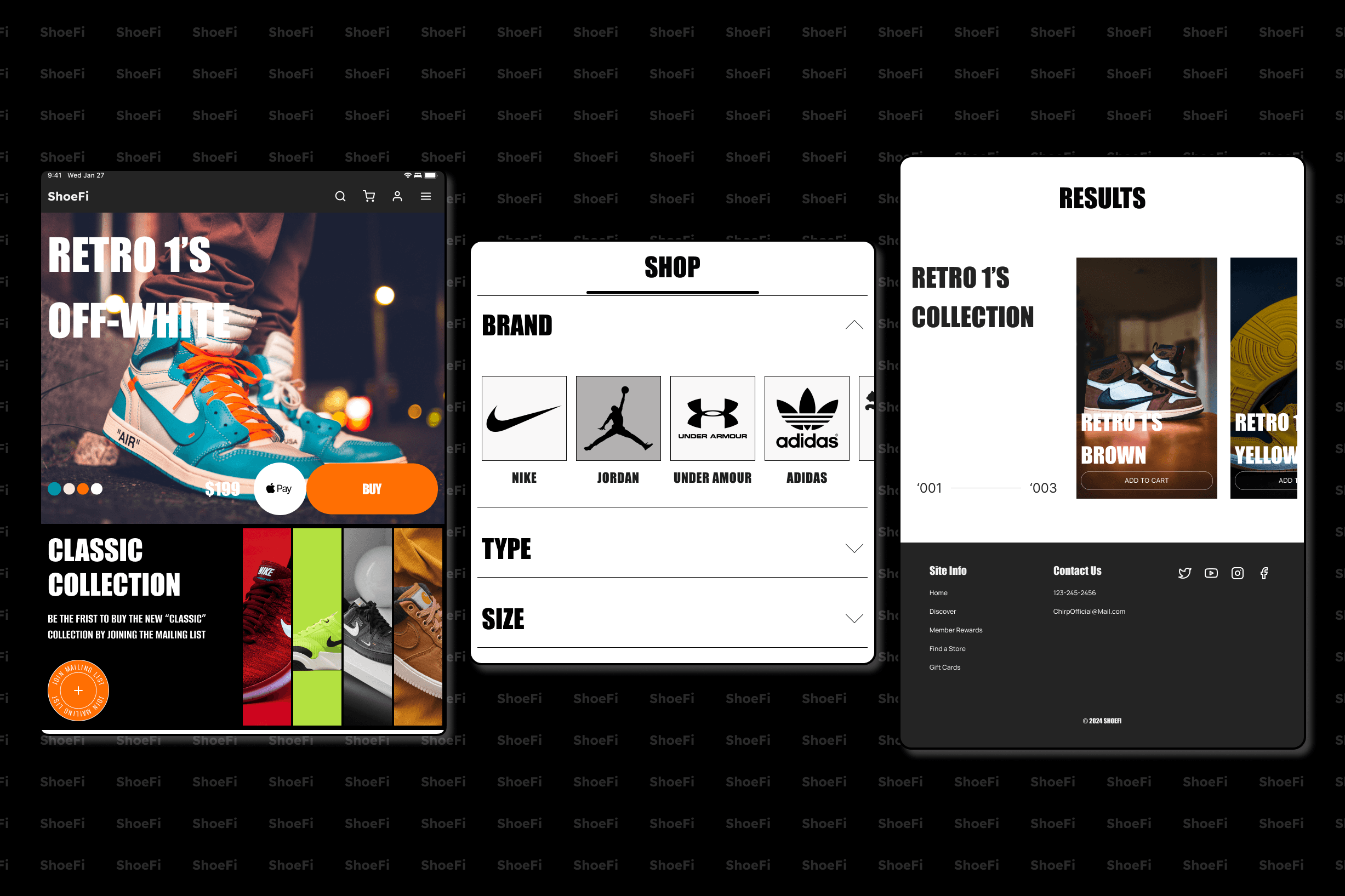
The First project I worked on in this course involved designing four unique interfaces using different themes, text styles, and colors. These themes encompassed different attributes from modern, minimalistic, and brutal design. The standout feature I took advantage of was auto layout. This future helps create dynamic and responsive layouts by automatically adjusting and positioning elements based on pre-defined rules that you can adjust on the fly. This tool in Figma can be akin to the CSS flexbox layout model.



View Figma File
Variables
In this project variables were the main tool of focus. Variables in Figma allow designers to create and manage reusable values that can be applied across different design properties. You can have reasonable values to store things such as colors, typography styles, spacing and other numeric values that can be reused across the entire project to create consistent deisgn elements.
I demonstrate my use of variables break creating a single UI design that I adapted into two different viewpoints ( desktop, and mobile) and for different thematic modes (light/dark Modern and light/dark Simple & Sharp).


Primitives
The fundamental building blocks of creating reusable design elements. Primitives store simple raw values that can be applied directly to design elements. These include things like color values, numeric spacing values, and Boolean true or false values.


Tokens
Tokens are set of design variables that represent the core visual attributes and properties used throughout a design system. Inherit their values from primitives and have logical and consistent naming conventions to be applied in designs. I used a slew of tokens for text, surface, and icon colors as well as corner radiuses and spacing.
For example: My Text Token “Text – Primary” holds a different primitive value color across all four themes.

Viewpoints
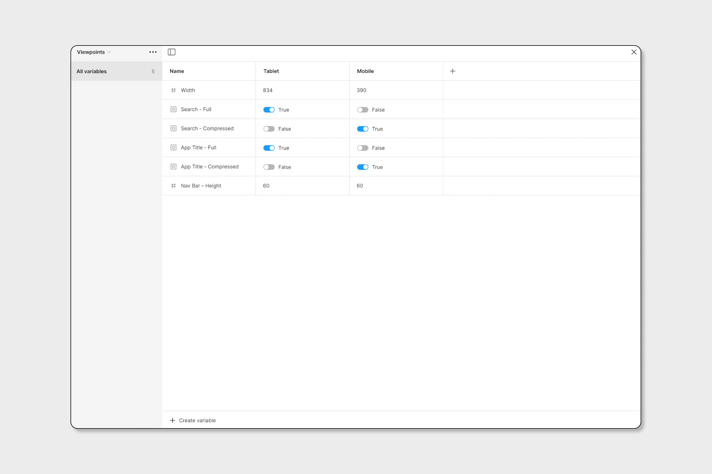
Viewpoint/Breakpoints include instructions on how a design changes based on the size of the viewport. Some elements may be visible or hidden based on the viewport (For example the full search bar is only visible on the desktop viewport where on mobile it’s just the icon.) , as well as changing the sizing and spacing of elements. These variables allow for seamless adjustments across the design over multiple screen sizes.
View Figma File
Final Project
This project consists of all the techniques I've learned throughout this course. I created a fictional platform called "Chirp", a social platform for artists to showcase their work while also discovering others. Think of it as a mixture of social media platforms like Twitter, Tumblr, and Reddit. This project showcases my ability to create a scalable design system that can be used to create a large-scale platform.

Components
Since there were multiple reasonable elements for this platform, I utilized components within Figma. Components allowed me to create variations of the same element throughout my design. Below I've included some examples of components such as Card variations, buttons, nav bars, text input fields, etc.


Component variables
Component variables are customizable parameters that allow you to easily change elements within a component from instance to instance. You can adjust specific aspects of a component without detaching it from its Master making it easier to maintain consistency across the design. For example, within my card component, I can create a variable that changes the visibility of the image within the card, and change the text on every element within the card.

Prototyping with variables
Prototyping with variables allows for a seamless transition between different styles and themes with a simple button press.

View Prototype
View Prototype
Conclusion
The course was incredibly impactful to me. It helped guide me through the exploration and application of advanced UI and prototyping techniques with Figma. Through practical exercises, I created diverse user interfaces and interactive elements, enhancing my skills with features such as Auto Layout, components, and variables from Figma. I was thrilled to see my growth from the beginning to the end of this course. It not only enhanced my visual design skills but also bolstered my overall growth as a designer!
© 2024 Copyright: Jalen Battle
